Island diversity
‘Island diversity’ ink on collage paper 10″x4″ © J.Hart 2019

As some of my readers may know, I’m an artist (www.jhart-artist.com) who writes a blog  http://www.realmofcolor.wordpress.com as well as betterchoices.blog, which is a place to put my concerns about the present unfolding climate catastrophe. The following is a reprint of the most recent Better Choices post.

Ever since my graduation from Rhode Island School of Design, a lifetime ago, I have been haunted by the question of how art, and I as an artist, could respond authentically and adequately to what I witness both in every day life and read in books about the unfolding catastrophe that is climate change (the most recent book I read is David Quammen’s The Song of the Dodo, which is a great read on how extinction works and the scientists who study and theorize about it).

The question has a number of facets: firstly, there is the issue of content. Do I use figurative imagery to express my moral ideas as someone like Kara Walker or Banksey does? Or do I avoid the whole dilemma by making abstract art like Thomas Nozkowski or Howard Hodgkin, both of whom I admire.

Then there is the relationship of art to the environment. Ever since I was trained as a painter, the understanding within the art world is that a serious, professional artist would, of course, make large pieces of art, and lots and lots of them (even Hodgkin, at the end of his life, succumbed to this pressure!). The issues of use of the Earth’s resources, storage, and pollution are ignored within the same rationale that is used to justify abstraction: art is essentially good and operates outside real world norms.

And finally there is the most difficult of problems: the way art is and has been my whole life tied to runaway capitalism and the superwealthy. I went to a Saatchi Other Art Fair recently here in Dallas, and I was appalled by the banality of the work and the sheer commercialism of it all. The works, mainly paintings, were of the Zombie Formalism or Zombie Abstraction variety (https://news.artnet.com/opinion/history-zombie-formalism-1318352). The work was overwhelmingly decorative, which is to say without content at all (and especially nothing, God forbid, of a political nature). I found the only paintings with a heart or soul were those of Jammie Holmes (www.jammieholmes.com); his were also one of the few booths showing figurative art.

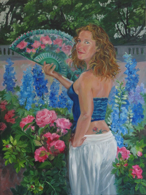
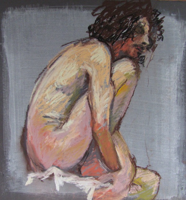
So, presently, I have decided certain things about how I will make art in this fraught time. First, and foremost, I am working small. My most recent pieces are 4 inches by 10 inches!

Secondly, I am working with inexpensive materials: collage using paint chips from paint stores; ink on paper; and whatever art supplies I have on hand. This latter category is rarely talked about, but, in a consumer society, we artists are encouraged to buy a lot of art supplies, and to spend a lot of money framing our art as an expression of its value and our professionalism.

Thirdly, I am offering my work in multiples online and in book formats which are more accessible. Any large work I do will be ‘in situ’; murals are a good way to display art publicly and live with it privately without framing or storage.

And, finally, I am continuing to alternate between figurative and abstract work. This is a conscious political choice to avoid that recent most pernicious expectation that we are all in the business of working on our ‘brand.’ My work does not represent a brand! And, as a thinking, feeling artist, if my need for different formal means for different projects messes up the marketing of my art, well, I think I can live with that!

Perhaps all of these seem like small choices, but they are, for me, better choices, and more in keeping with the Earth first values that I am attempting to live. I would love to hear how you have resolved the dilemmas between your work and your life in the time of climate change…please drop me a comment!

First Self Portrait!

detail of self portrait with Serdar's scarf 9-20-18 web
‘Self portrait with Emily’s scarf’ (detail) watercolor pencil and gouache on paper © J.Hart

I have done very few self portrait in my career: never thought that my face was so interesting. However, while researching portraits, I looked at various artists’ self portraits and was encouraged to do one of myself. Not sure how good a likeness this is, but I feel that it is a good drawing.


Live vs. Photo (2)

These portraits are again from a photo and from a live sitting (the one on the left from a photo) of a friend who was visiting from Berlin. The one done from life is a better drawing capturing as it does a certain intelligence and characteristic expression of the sitter. However, as Mirka remarked (and she was right!) the drawing makes the width of her face too narrow.

Interestingly, it took me three tries to get close to a resemblance when working from the photo. Mirka’s face is asymmetrical ( actually all of our faces are, but some people are more asymmetrical than others), which I got in the sketch, but struggled with when using the photo. And again, as a drawing, the one done from the photo has an overworked quality which I don’t like.

I’m going to do one or two more drawings of Mirka, this time working from the drawings rather than the photo. Let’s see what happens!

Live vs. Photo

Many (most?) artists work with photos when they do portraits. The advantages are clear: the sitter is not forced into hours of boredom; the artist can draw and redraw the face in her own time; the hard work of going from 3D to 2D has been done by an apparatus. The problem, I find, however, is that there is a tendency for the portrait done in close dependence on a photo to often look “frozen”, stiff, and inhuman!

There is something in the drawing using stereoscopic vision with the breathing model in front of me, that captures the energy and reality of the living person better than a drawing done from a photo. The downside is that sometimes the resemblance slips away (and that can happen, maddeningly, with a slight mistake in the distance between the eyes or the length of the chin or the shape of an eyebrow!).

In previous centuries, the best artists could not only get a resemblance, but they also (amazingly) could retain the image of the person and repeat it from memory! However, part of this skill came about because artists redid work: redrew, repainted, reconceptualized the image, as can be seen in many Degas studies. I was not trained to do this, but I am going to be working this way for awhile to see what I can learn from it. The trick, I think, is to reverse engineer the image in the photo to recapture the vitality of the living model.

My friend Val was kind enough to sit for me recently for the drawings at the top of this post. I usually draw for about 1/2 an hour then take photos of my model. The drawing on the right was done from life; the one on the left from the photo I took during the same sitting. The drawings are, as always, watercolor pencil on paper.

The Daily Practice of Portraiture

Chris with Bonchat
‘Chris with Bonchat’ watercolor pencil on paper 11″ x 15″ © J.Hart

I am going to take a suggestion from Seth Godin and start a daily blog of my portraiture work. I am practicing doing portraits in order to become as skilled as possible so that I can work with live models as well as photos. Also, doing this practice in public will keep me honest and on task!

Today’s drawing is of my neighbor Chris with his very ironically named cat, Bonchat sitting on our balcony in late summer. This portrait got to the heart of their relationship: undemonstrative cat, very loving master!

Although I did this from a photo, I worked to get some of the more interesting and less definitive marks of unmediated seeing. It is also fun to do portraits of friends and family that I know well. The portrait is more likely to be an authentic representation of the person.

More on the difference between working from life and from photos tomorrow!


‘The Blame of Portraits’

Martin eyes closed 2-16-15
‘Martin with eyes closed’ oil pastel on board 11″ x 14″ © J. Hart

“For the image of the sitter on the artist’s retina is passed on its way to the canvas through a mind chock full of other images; and is transferred-Heaven knows how changed already-by processes of line and curve, of blots of colour, and juxtaposition of light and shade belonging not merely to the artist himself, but to the artist’s whole school…and, in truth, a portrait gives the sitter’s temperament merged in the temperament of the painter.”    from Vernon Lee’s Hortus Vitae: Essays on the Gardening of Life (1904)

Vernon Lee was the nom de plume of Violet Paget, a good friend of John Singer Sargent, who painted a lovely portrait of her that can be found online. She was an art historian, feminist, and pacifist (1856-1935).

Gilles Deleuze also noted, in his wonderful book on Francis Bacon, that the problem with beginning a painting is not that the canvas is blank, but that it is too full of everything that the artist has seen, which must be let go to begin a new piece.

Why do I paint?


Mirka 8-18 watercolor pencil
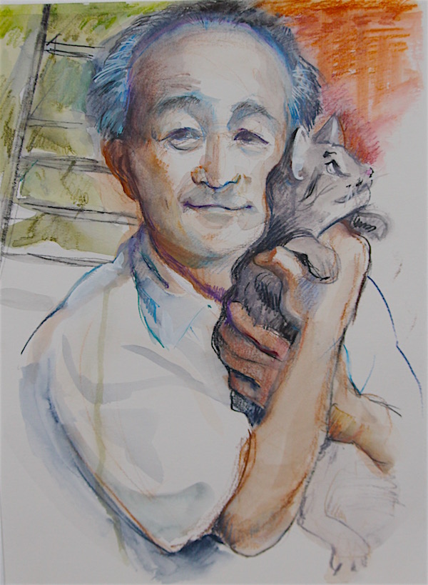
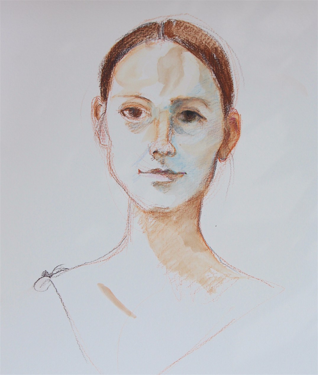
I did a portrait sketch of Mirka, a friend visiting from Berlin; and she asked me why I paint. It has taken me a while to articulate why I paint, but I believe that I do it in order to witness, just to witness the world and the life we live. It is not to pontificate or criticize or propagandize, but to simply record what is not being seen.

This may seem to be redundant: in the age of the iPhone, everything must be recorded, mustn’t it? But the reality is that much is ignored: the musicians and the homeless in the street; the beauty of weeds; the majesty of the trees that tower over our neighborhoods. We don’t really see what the city looks like as a whole, as we experience it in disjunctive pieces: destinations like our home or shops; or liminal spaces like bus interiors and metro stations; or our personal home. We also rarely look for any length of time at anything: neither people’s faces, nor their bodies, nor Nature in any of her manifestations in the city (nor, for that matter, paintings!) .

So there are many subjects that a figurative painter such as myself has available to her; and for a viewer, the focus of a painter’s work appears to be the subject: peonies, portraits, landscapes. But for me, as for many painters I believe, the subject is just one aspect of the painting, just the hook on which equally important concerns are hung. Degas’ ballerinas, Daumier’s laundresses, Bonnard’s dining room tables, or Rembrandt’s self portraits are just the way to open the conversation around what painting can do and how a painter can express herself. And this is the second reason that I paint: it is to witness the act itself as it leaves a record of what was seen and felt.

I was an abstract artist at one point in my life, but infinite variety of forms, color, surface, and subjects in the world drove me back into figurative art. For instance, peonies are beautiful in the manner in which they move through space, react to light, and present structures (the seed pods, variously shaped specimens from single to bomb, buds, etc.) slightly weird and always interesting. Faces are wonderful and difficult as structure, surface, and expression; painting a portrait is rather like a complex juggling act with a critical audience (the sitter)! And people in groups in a landscape almost impossible to capture as the complexity of interrelationships reaches a critical level!

Painting for me is comprised of two necessary components: skill and risk, neither of which alone is sufficient. Most figurative paintings that pass as art today are skillful copies of photographs. They are D.O.A. You can feel that nothing was at stake for the artist, and I can’t imagine anything more boring than spending hours copying a photograph! But it is very hard to move beyond the comfort of skills well honed, and this is where risk is so important. It is, I suppose, the final reason I paint: for the excitement of trying something new, and accepting the risk of failure.


When Fashion is Art

Tanguera with rose tattoo web
‘Tanguera with Rose Tattoo’ © J.H.Hart ’16 Oil on canvas.

I saw two shows at the McCord Museum (http://www.musee-mccord.qc.ca/en/) yesterday. One was positively thrilling: it was the Balenciaga show with much borrowed from the Victoria & Albert Museum in London. The other show, on another floor, was ‘Marisa Portolese-In the Studio with Notman’, a response to the great William Notman (https://en.wikipedia.org/wiki/William_Notman) collection of photographs archived at the McCord: much much less thrilling for reasons about which I will write.

Balenciaga worked with fabric, fashion, and the human body, but like many haut couturiers (https://en.wikipedia.org/wiki/Haute_couture) he was as much of an artist as was Picasso or Isamu Noguchi (https://en.wikipedia.org/wiki/Isamu_Noguchi). I think of haut couture as a type of sculpture. Like any other kind of high or fine art, it is tied to the needs of the historical moment in which it is created, but its appeal outlasts that moment. It is created as a response to its contemporary society’s understanding of beauty, but it speaks to future generations; and it is usually supported by wealthy patrons as most art has been.

Like all great art, Balenciaga’s works resonate beyond the time in which he created them (1930’s-1970’s); and the McCord finished this exhibit with a wonderful room illustrating the continuing discourse that designers like Issey Miyake, Alexander McQueen, Sybilla, and many more had and have with his ideas.

My favorite pieces, the serene, minimalist, wickedly constructed ballgowns from mid-century, wrapped around the body in amazingly beautiful volumes of fabulous fabric. They appeared to be constructed like life-sized origami in which all that showed of the body beneath was the ankles, or a wrist, or a small section of collarbone or upper back-modest but tantalizing!

I really appreciated the way the McCord set up the displays, placing the muslim mockup next to the finished gown, and showing in a nearby video the actual layout of the pattern and how it was folded and sewn to give the effect of seamless simplicity!

To go from this elegant and refined exhibit to Marisa Portolese’s exhibition was particularly jarring, and gave me the disheartening sense of how much we have lost of craft and sensitivity to technology ! Portolese’s huge-sized photographic portraits, supposedly referencing Notman’s studio sittings of women, shockingly reminded me of how impoverished our time has become, both in the quality of the clothing that people accept (and are willing to be shot in for posterity!), and in the banality of the spectacle which appropriates great artists’ work (blown up photos of Van Huysum’s bouquets https://en.wikipedia.org/wiki/Jan_van_Huysum) to act as background posters in what feels like nothing so much as bloated selfies!

Clothing is a form of communication, of portraiture, and of performance. The subjects of the original Notman photographs (shown in a small walled corner of the exhibit in a chuck-a-block checkerboard that was all visual noise!) would never consider sitting for a portrait that will go down through history in anything less than their best outfits! But Portolese’s sitters, showing up as they did in a collection of uninspired and cheap looking costumes, suggest to me that they feel at heart that fashion is of negligible interest as an art form or that fashion cannot represent their true selves but is only a vanity that should be ignored or resisted.

When Balenciaga showed his collections, he did it without music, making his models walk as if in a trance, not making eye contact with his buyers. He endeavored to put all the focus on the clothes, on his art. And when one of the very wealthy women who bought his gowns wore it to an affair, she was not only performing status and wealth, but she was also showing her support for his art especially as the more abstract pieces hid much of the woman’s body and appeared as a piece of body sculpture that it was.

Under any circumstance, try to see the Balenciaga show which will be up until the 14th of October. First Sunday’s in each month are free for residents of Quebec: you just need to give them your postal code. Enjoy and check out the wonderful hats designed under the Balenciaga label!


Lost time…

Claire de Lune for Painter's Progress 6-18-18
‘Claire de Lune’ Peony Watercolor pencil on paper

I just took a year off from painting, at a point in my life when I really don’t have that much time left!! I didn’t mean to stop the work, but a series of difficult geographical moves left me without a studio in an unexplored part of America.

It is always detrimental to an artist to find the physical environment in which she works compromised. This is especially true for someone like me who, as an ADD personality, has only the most tenuous hold on discipline and forward momentum! When I had to close up my studio in the Belgo Building in Montreal and then chose to move to my daughter’s apartment in Dallas, Texas, I had thought to continue my floral and portrait work in Texas. Unfortunately,  I found the loss of the Botanical Garden and my Montreal tango community very disorienting. It was as though, with the loss of my muse and my audience, I also lost my train of thought!

Without the distraction of a whole new planet to explore (and Dallas was like another planet!), I hope to get back on track with my painting during the next five months in Montreal. Happily I am back in time for peony season. This will be the third June that I will be sketching in the Botanical gardens. This time I will be using the watercolor sketches as the basis for paintings. The big challenge with this is how to maintain the spontaneity of the sketch in the oil painting. And my struggle continues to discover my unique ‘voice’ within a traditional subject matter.

The one useful thing that came out of the yearlong pause, was that, upon my return, when I unpacked my studio, I realized that many of the drawings and paintings I had done in the past four years were not worth keeping! So ruthlessly I threw tore them up or painted them over! (The noise you hear in the background is my friend André screaming “noooo!”). But here is the thing, after a year away from the work, it is very clear which pieces work; and which don’t, which have the germ of future directions, and which are simply going over the same tired ground. The laws of minimalism and sustainability apply here as well as everywhere else in my life!

I am looking forward to continuing this blog, The Painter’s Progress. I expect that doing my work in public, in front of you,  my readers, will keep me honest. As always, your feedback is my inspiration!

Magnolias!

'pinkie' magnolia web
Magnolia ‘Pinkie” Water colour pencil and gouache on paper 11″ x 15″

Spent the past week at the Botanical Gardens. The magnolias were in spectacular bloom until Thursday when it went up to the high 80’s. I actually got to see blossoms open, bloom, and then drop their petals even as I was drawing!!

saucer magnolias web
Saucer Magnolia Water colour crayon on paper 11″ x 15″

The Garden also had some yellow saucer magnolias that were lovely but I will need to catch them next year.  Magnolias bloom before their leaves are out so the flowers and branches make for striking designs.

'Butterflies' magnolia web
Magnolia ‘Butterflies’ Water colour pencil on paper 11″ x 15″

One special point of information for early birds: the Botanical Garden is offering, if you are a Montreal resident, a card that would allow you access to the outside gardens between 6 am and 9 am every morning! It costs 8$ for the year. This will be particularly nice in the hotter part of the summer!

Un point spécial d’information pour les premiers oiseaux: le Jardin botanique offre, si vous êtes résident de Montréal, une carte qui vous permettra d’accéder aux jardins extérieurs entre 6 h et 9 h tous les matins! Cela coûte 8 $ pour l’année. Cela sera particulièrement agréable dans la partie la plus chaude de l’été!